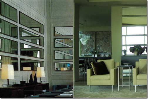
I have always been fascinated by the *magic* you can create in a room simply by using mirrors. The effects this material has, the tricks it can play on the mind, are completely mesmerizing. If done properly and tastefully (yes, mirrored walls can look tasteful), you can perform miracles on a space simply through optical illusion. Let me show you how…
If you are selling a home/space, or simply just wanting to enjoy the space you live in (as everyone should), wouldn’t it be nice to give the appearance of double the square footage in a room, or double the fabulous view? Well, you absolutely can do that! The below image on the right was featured recently in Martha Stewart Living. It’s in Kevin Sharkey’s NYC apartment. I’ve been thinking about doing this in a room in my own home across from a wall with windowed doors, but he beat me to it!
Kevin got the idea to do horizontal mirrors from a private Chanel dining room in Paris designed by Karl Lagerfeld. In his apartment, the mirrors reflect the view of the Hudson River and “…transform the view into art.” Fabulous idea. One of the reasons I’ve been thinking about doing this is because you can pick up full-length mirrors at Wal-Mart for about $10 a pop and create this same look simply by hanging them sideways. Now, I’m typically not a fan of design via Wal-Mart because of the cheap quality and look, but it’s just mirror. Used in a creative way like this- no one will ever know- shhh…
Another great way to pull off a mirrored wall is to do it in panels with some sort of additional accent to break it up, like below. Using rosettes, trim, molding, even buttons, you can create a personalized wall that won’t look straight out of the 80’s. I think the rosettes or buttons are nice because they give a softer, almost quilted, look to the wall…
(littlegreennotebook.blogspot)
Lastly, one of the number one things that is sure to make a wall of mirrors look great is what is reflected in it. The wall in the image below (from Vogue Living July/August 2006) could potentially look tacky, but the saving grace here is that the pieces it reflects are so beautiful, the full mirroring is much less offensive. Also, the tall, slim lines are very helpful- drawing your eye up and looking more supermodel-esque than typical floor-to-ceiling mirror panels. I’m not sure if this is what’s happening in this particular space, but it being a small one, this would be the perfect opportunity to hide some much-needed storage that could otherwise close in this room. Losing 12-18” in depth along an entire wall in a small apartment is an unthinkable sin, but hide that storage behind mirrored doors that visually give back the other 90-120 square feet, I think that’s a no-brainer, don’t you?


No comments:
Post a Comment