26.10.10

Client Fiction: Brad & Angelina


As I flip through the design magazines that show up in my mailbox every month and see a famous so-and-so’s L.A. home or far-away retreat, I always find myself imagining what I would do for a celebrity client. Something that I find utterly fascinating about design is how much psychology is involved in it. I love to listen to people’s thoughts, wishes, and needs, learn about their lifestyle, gather information that some people may think is unrelated to design (favorite drink, wardrobe choices, ultimate vacation destination, passions, etc.), and begin to pull the pieces together to develop a look that perfectly reflects them. Figuring people out, “getting” them, is a total blast! It’s like cracking a complex code to get to some fabulous sparking jewel…it’s a real rush!

One thing I like to do in my spare time as sort of a “game”, something to keep my brain sharp like with mind puzzles and riddles, is to pick a celebrity to create a design for. I gather a series of images of that celebrity, do a little research on them, and think about what kind of person they may be and how they present themselves to the rest of the world. Based on all the information I have, I try and “crack their code” and design a space that I think reflects them.  

Today’s client fiction is actually a couple- Brad Pitt and Angelina Jolie…Picture3

Based on these images and what I know about them as individuals and a couple, the key words I felt I needed to incorporate in their design are as follows…

  • cool
  • modern
  • simple
  • sophisticated
  • tailored
  • architectural
  • confident
  • masculine
  • feminine
  • sexual/sensual
  • badass/tough
  • dark/mysterious
  • strong
  • sultry
  • smoky
  • family
  • philanthropy/altruism
  • coexistence of individuality and unity

I drew up a quick sketch of an imagined bedroom/sitting room for them (below). The bedroom is in the foreground, a balcony would run the length of the room on the other side of the Nana wall system (sliding window/doors), and the sitting room is on the other side of the fireplace wall. Taking a cue from my key words, I kept the lines simple and strong and incorporated dark colors and metals, but was also sure to blend in some curves, soft textures, appropriate colors, and natural elements to keep a nice balance. I pulled in some items from Africa, knowing that this is an important place to the family, and included subtle “global” hints, since this dynamic duo travels a lot, aids people around the world, and has several adopted children of different ethnicities.

One of my favorite design statements is the soft, supple black leather used for the headboard, which I ran all the way up and across the ceiling. The paint color (used as the background for the design boards below) is Ralph Lauren Galvanized, with Neutral Brown (not shown) on the ceilingCCF10222010_00000

Here are the design boards I created…Picture1

(Left to right, top to bottom)

  1. Maccasar/Black Ebony wood paneling and doors for concealed closet and bar, and long, sleek custom see-through fireplace with calibrated honed and gauged black slate tile above and below it
  2. Black Edelman Calf Luxe leather for headboard and ceiling treatment
  3. Corbett Lighting Vertigo pendant over bedside tables (made of hand-crafted iron in bronze with gold leaf and caramel ice finish)
  4. Robert Hansen’s Chac Mul- made of automotive lacquer poured onto masonite which was cut into the shape of a woman’s body (free-standing piece)
  5. Lionel Gilbert’s Blue on the Side oil on canvas
  6. Armani Casa Bottecelli bed
  7. 1950’s Italian tables by Aldo Tura, used on either side of bed, made of goat skin wrapped wood topped with smoked glass (they remind me of hands lifting something up- a nod to helping those in need)
  8. Pillows by Calvin Klein and Armani Casa, green velvet in front by Holly Hunt (tweeds, shimmering fabrics, soft velvets, and subtle pin-stripes were influenced by the couple’s wardrobe, along with other things throughout the room)
  9. Charcoal grey Tibetan lambskin rug
  10. Calibrated honed and gauged (which creates a smooth, even surface) grey slate slab flooring (radiant heating underneath)
  11. Billy Wilder chaise by Charles and Ray Eames, ca. 1968
  12. Bronze mesh metal curtains which run along entire wall of windows

Picture4

  1. Children of Africa photographs found via Google image search
  2. Raimond LED Suspension by Moooi for Lumens- sphere made of polished stainless steel containing 252 LED lights throughout- 35” in diameter (one of the many global references- representing people across the globe and how we’re all connected, each with his/her own “light” which they create)
  3. Japanese oil on canvas, titled Green Symphony, by Hiroshi Nakamura, ca. 1958
  4. Serpentine art by Parisian artist Guido Mocafico
  5. Sofa by Armani Casa
  6. Pillows by Calvin Klein and Armani Casa, Zambian Kuba Cloth pillow from Room and Board through Toka, a company who helps African women become financially self-sufficient
  7. Original 1960’s polished chrome and leather lounge chairs by Michel Boyer
  8. Bax rug from Armani Casa
  9. Custom 1970’s smoked glass cuboid end table
  10. Italian cocktail table made of chrome with brass inlay and glass top, ca. 1970’s
  11. Black powder-coated steel sculpture by Ray Klausen (to me, this has notes of mother and child, love, security, and the circle of life, to name a few…a very spiritually-inspired piece, I think)
  12. Original Robert Loughlin acrylic painting

That was a fun little project! I don’t know Brad and Angelina personally, but based on all you know and have heard/seen of them, do you think I hit the nail on the head? Did I convey them accurately through my design? Is there something you would do differently? I would love to hear what you think…

14.10.10

Design Show and Tell: Living Room


Just got back this week from vacation…sad that it’s over, but glad to get back to my blog!

This living room was one of the biggest challenges of the home, as I mentioned before. It was long and skinny, which posed several issues for furniture layout and traffic flow. However, it did have some great features to work with.

I love the fireplace. The white painted stack stone is a great focal point which can be seen from the dining room and kitchen, through the big window from the deck (which I added), and as soon as you walk through the front door.  It adds great texture and a little fun to the space, making it less formal and more lighthearted and modern…

100_1972CIMG1636

This shot is facing the kitchen from the fireplace. Where the two people on the right are standing is the dining area…CIMG1638

I actually left these ledges on the wall. I love that they sort of disappear into the other stone, giving the illusion that whatever is sitting on them is floating. I also added down lights to highlight the depth and texture…100_1970 

So here are the changes I made…

I was able to push back part of that load-bearing wall which gave me a walk-through space necessary for good traffic flow. This allowed a place to put the chairs, keeping them connected with the living room but also giving them their own little “nook.” I knocked down the wall to the left of the fireplace because, as far as I was concerned, it was pointless. Since Susan wanted a space that would be conducive to entertaining, maneuverability was key. You can easily circulate from foyer to kitchen to dining to living room, into the sunroom (on the other side of the fireplace), and onto the deck and back. I changed the door swings in the sunroom and living/dining room to open onto the deck to give more space inside…  CCF10142010_00001

These are just some rough “brainstorm” sketches of how I wanted the space to look. I specified a slab of Carrara marble for the raised hearth seat and added cabinets in glossy white underneath for extra storage (maybe for some great floor cushions)…CCF10142010_00000

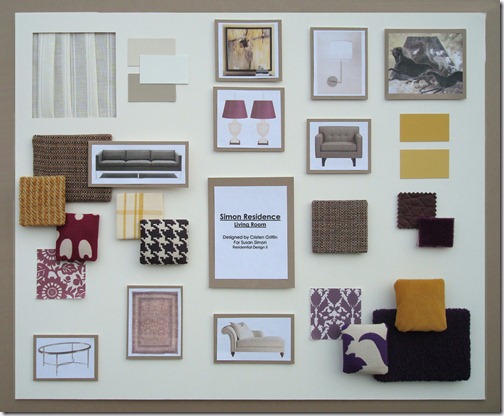
And here is the design board. I went with a purple and yellow color palette which I thought was sophisticated without being too serious.

  • The chairs are from Room and Board upholstered in a tweed
  • The chaise is from Baker upholstered in a Knoll boucle
  • The 1964 sofa is from Hive Modern upholstered in a Room and Board tweed
  • The pillow fabrics are in a variety of great patterns and textures including a graphic hounds tooth, faux croc, mohair, velveteen and chenille, all from Duralee, Calico Corners, Glant, and Stout. I chose these fabrics because they are traditional materials and patterns with a modern spin and in fresh colors, keeping with Susan’s personal style …

The sheer fabric on the top left (by Kravet) is for the window treatment. The style is shown below… CCF10132010_00000 

This is the art on the wall behind the chairs. It is actually a Japanese screen made of mulberry paper with horses and cranes in front of Mt. Fuji painted on with mineral pigments and gold. I love the smoky tones and the subtle buttery and dusty lilac colors which tie into the rest of the room… CCF10132010_00005

Another great piece of art is this 1974 GQ cover from Conde Nast with Robert Redford on the front… CCF10132010_00007

This pen and brown ink is called “Allegory of the Liberal Arts” by Domenico Piola from Genoa, Italy, dating back to the late 1600’s.  It was a prep drawing for a large decorative canvas…CCF10132010_00009  

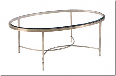
The coffee table I wanted to be beautiful, feminine, and light in visual weight, so I chose this one (and a matching end table for between the chairs) from The Thomas Pheasant Collection for Baker, made of antique brass...

CCF10132010_00003 CCF10132010_00004

Next to the sofa is this great Italian mercury lamp. The two white urn lamps with silk shades on the right were an option if the client preferred a more traditional mantle over the fireplace. Great because they’re traditional in shape and modern in color…Picture1 

I am crazy about these fun little things! They are brass “Kaleidoscopes” by Kelly Wearstler for Bergdorf Goodman. I thought they would look fabulous on those ledges over the fireplace or to one side on the hearth seat…

Kelly-Wearstler-Kaleidoscope_9B49324F

And last, but not least, is this show-stopper of a rug. A to-die-for Persian Tabriz in golden wheat and blackberry tones. To be drooled over, but certainly not on, since it runs about as much as my house is worth. But hey, that’s the price you pay for a drop-dead gorgeous home and I guarantee once it was on your floor, you would never regret it. Like a shot of Botox for your home and worth every pennyxBB3452

5.10.10

Design Show and Tell: Kitchen and Dining


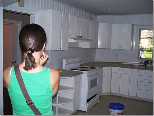
I’ll start the “before” photo tour standing in the living room facing the front door and kitchen and go 360 from left to right…

Notice the beautiful light fixtures?…Picture8

As you can see, the kitchen had two entrances right next to one another, one of which I considered pointless and a waste of space (the smaller one below), so I closed it in to gain a lot more storage…100_1968CIMG1640CIMG1641

You can see there is one long wall here that is completed wasted as well (never a good thing, especially in a kitchen) and there’s all this floor space that’s not being used either, which is why I planned for an island…100_1969

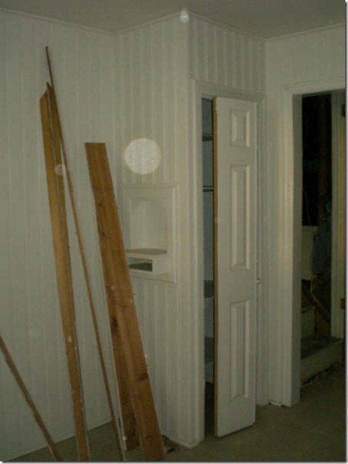
Directly across from the fridge (if your turn facing the other side of the kitchen where the large entrance is) was this odd little tiny pantry space and another entrance/exit to the garage stairs and the upstairs. It was a poor use of space and very disconnected… CIMG1643 

Standing in the kitchen, you can look into the stairwell on the left (next to the old little pantry) and the dining/living room… Picture9

New plan! 

I…

  • closed off the stairwell entrance, moving the door to the garage and opening to the upstairs just outside the kitchen to re-coup even more space (for the cook-top below)
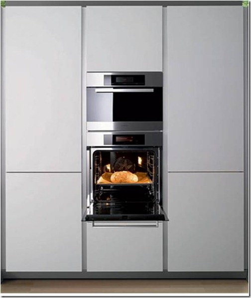
  • ran floor-to-ceiling storage all along the right side, complete with a 42” side-by-side fridge and double ovens
  • added an island with a wine cooler and bar stools (great place for her son to hang out while she’s cooking)
  • that large fabulous window for some much-needed light
  • and plenty more storage along the left wall… 

Picture7

On this first elevation drawing, you can see all the great storage I provided. I think floor-to-ceiling storage in a kitchen is a real dream. (I did all of the cabinetry in a high-gloss white on flat-fronts with stainless steel hardware…Picture7

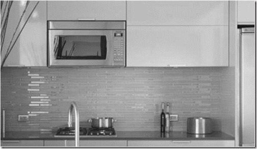
Here’s some of what inspired me…Picture15Picture17

Here in the second elevation (the left wall) you can see the cool horizontal uppers along with some open shelving created from the re-purposed tree out front…  Picture7

Here’s the inspiration for what I did along this wall…

The tile I specified for the backsplash was this same color green, but in a small, matte subway… Picture16Picture21 

This is the final elevation showing what used to be the garage and stairwell entrance, but now houses the microwave, all-induction cook-top, and bi-fold doors with pull-out shelves for pots and pans…  Picture7

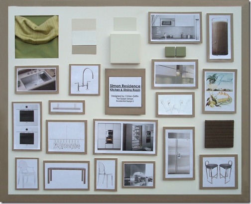
Here is the design board with all the highlights. The color scheme is a creamy white with accents of celery green and mocha…

In the top center is the cabinet color and below it, the Silestone counter. On the far right is something fun I came up with for a huge piece of artwork on the wall next to the window. It’s a giant glass of chocolate milk…

Picture24          

Then we have a great piece of art from Conde Nast- a vintage Gourmet magazine cover. Yummy, huh?…Picture23

 The barstools are 1970’s Pierre Cardin which I had re-covered in a Room and Board fabric in the color Mink…

Picture22

Over the island is this fun and funky Octopus light from Autoban-De La Espada…Picture14 

Crazy about the retractable glass vent from Arclinea…Picture25

The sink and faucet were by Kohler, the appliances were Viking, Sub-Zero, and Electrolux.

And for the dining area between the kitchen and living room I had to be careful. It was a pretty tight space, so I used an extendable table, clean, no-fuss lines, and clear chairs that would take up very little “visual” space…

Picture26 Picture27

 I used the chair with arms at the head and foot, and the armless on the sides…Picture29

Stayed tuned for the living room!…

1.10.10

Design Show and Tell


I thought you guys might enjoy seeing some design boards of mine from a past project, so I decided to share. The house is a story and a half, so I’m breaking it up over a few posts…

Client: Susan Simon

Client Profile: Susan is recently divorced and in her early 40’s. She and her ex-husband have sold the house they owned together and are planning new residences. Susan wants to stay in the same neighborhood so her ten year old son will be close to his friends and continue in the same school system.

Susan will be starting a home business to help with expenses, but wants to be flexible enough to be with her son when he needs her. Her business, designing web pages, will require a desk area for a computer and printer with light file storage. She would like to expand the potential of the house and add a half story over the front of the house.

She wants:

  • New kitchen in same location with slightly upgraded appliances
  • Laundry room
  • Hardwood floors throughout
  • At least three bedrooms including a nice master suite
  • Entertaining area adjoining the living room
  • One bathroom can be added & one bathroom can be relocated
  • All windows replaced and matching

Susan’s taste is light and traditional with a contemporary edge to it. Even though this house will be smaller, she wants the nice amenities she was accustomed to in her previous home.

Here is the existing house (and my behind- so sorry)…

CIMG1674 The problems I see are…

  • dark, dingy, and outdated
  • lacking in overall curb appeal
  • lacking in client’s personal style
  • tree in front visually splits the house in two
  • poor lighting
  • poor landscaping

Here was my solution for the exterior…

CCF09282010_00001

  • I added a half-story over the front portion of the home, using the largest dormer and tallest windows possible according to the structure allowances and building code (giving much-needed headroom and natural light, as you’ll see later on)
  • Re-shingled the roof with dark taupe-y/espresso-color mix and painted all fascia, gutters, etc. to match
  • Painted the brick (and downspouts) a nice fresh white to make the house stand out and give it a clean, modern facelift
  • Cut the tree in front and re-purposed it by building the planter boxes in the yard and adding open-shelving in the kitchen
  • Re-configured the walkway to have a gradual slope and step up as opposed to an abrupt set of stairs right at the door
  • Replaced and added lighting
  • Re-landscaped, adding a little spunk and whimsy to the yard
  • Replaced old, cheap door with a steel-reinforced European Oak one in espresso stain with modern, stainless steel hardware
  • Increased interior natural light with new larger, center-pivoting windows and sidelights (next to and above the front door)
  • Replaced garage door to complete the overall chic presentation of the home 

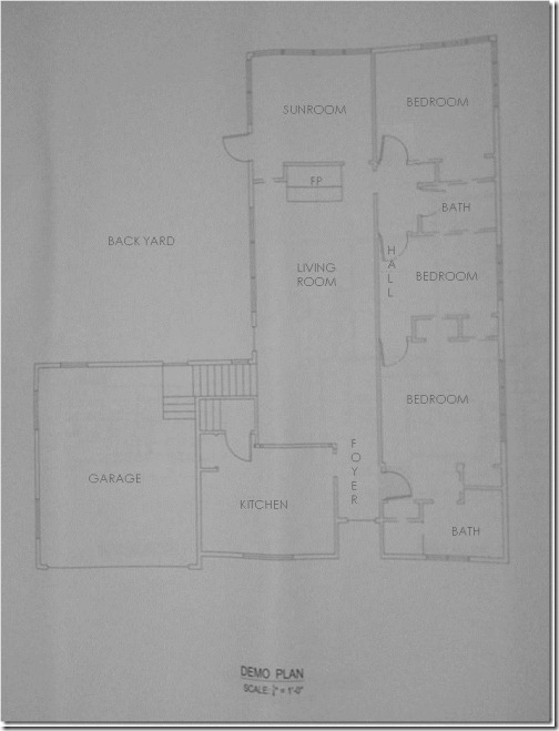
This is a very basic demolition plan of the existing (“before”) interior. It was very choppy and strangely configured. (Please excuse the quality- they’re photos of old drawings for which I know longer have the CAD files)…

Picture6 

This is the new construction and furniture (“after”) plan that I designed…

Picture5

I’ll cover all the “whats”, “whys”, and specific changes when I address the interior later, but in general, I addressed all the client’s needs and wishes, and then some, with some seriously creative space-planning. This was quite a challenging project, especially given that the center wall running between the left side (living, dining, and sunroom) and right side (laundry, bath, and master) was a load-bearing wall which, for the most part, could not be moved.


This is the board with highlights of the front exterior and the interior foyer…

The door is from Urban Front. They have a wide range of beautiful doors with tons of options…Picture2

I loved these white glazed terracotta lions from Italy. I thought they would “guard” the entrance quite nicely and give a hint of what was to come in the fun mix of contemporary and traditional inside…CCF09292010_00000

This is an example of what I meant by center-pivoting windows- located in the front of the house…imagesCAIEHLUJ

This is an installation image of the Metropoli lighting I specified from DWR (not shown on board, but worth mentioning). You can see them in my drawing, though, of the front exterior- located on either side of the garage door. I used them around the exterior, including over the entertaining deck. I love the soft glow they put off. Quite romantic, I think…Picture4

Also not shown on the board, but pretty nifty, are these solar LED lights from CSN Lighting. I specified them to line the walkway up to the front door. They soak up rays all day and then light the way in the evening…Nashville Bollard 2 Piece Solar Light Set in Stainless Steel

This is the Archetype pendant from Boyd Lighting that I specified for the foyer. I like that it is undeniably stunning, but subtle at the same time. Chic, dainty, and to-die-for…Picture3

Here is the Brazilian Walnut from Lumber Liquidators used throughout the home. I have always been a huge fan of this wood. I think the variations in color are so incredibly gorgeous…bw3s_rs

And last, but not least, this is the Tech Lighting K-Hello cable track lighting specified to run parallel to her hanging artwork to show it off. The light can be slid up and down the cable, and the lense tilted and rotated for the perfect angle of light…

unnamed


Up next will be the custom kitchen and dining where I’ll show you a beautiful color palette, unusual artwork you may have never seen before, and some tips for creating big impact while taking up very little visual space and staying flexible for party sizes. Stay tuned!…