I thought you guys might enjoy seeing some design boards of mine from a past project, so I decided to share. The house is a story and a half, so I’m breaking it up over a few posts…
Client: Susan Simon
Client Profile: Susan is recently divorced and in her early 40’s. She and her ex-husband have sold the house they owned together and are planning new residences. Susan wants to stay in the same neighborhood so her ten year old son will be close to his friends and continue in the same school system.
Susan will be starting a home business to help with expenses, but wants to be flexible enough to be with her son when he needs her. Her business, designing web pages, will require a desk area for a computer and printer with light file storage. She would like to expand the potential of the house and add a half story over the front of the house.
She wants:
- New kitchen in same location with slightly upgraded appliances
- Laundry room
- Hardwood floors throughout
- At least three bedrooms including a nice master suite
- Entertaining area adjoining the living room
- One bathroom can be added & one bathroom can be relocated
- All windows replaced and matching
Susan’s taste is light and traditional with a contemporary edge to it. Even though this house will be smaller, she wants the nice amenities she was accustomed to in her previous home.
Here is the existing house (and my behind- so sorry)…
- dark, dingy, and outdated
- lacking in overall curb appeal
- lacking in client’s personal style
- tree in front visually splits the house in two
- poor lighting
- poor landscaping
Here was my solution for the exterior…
- I added a half-story over the front portion of the home, using the largest dormer and tallest windows possible according to the structure allowances and building code (giving much-needed headroom and natural light, as you’ll see later on)
- Re-shingled the roof with dark taupe-y/espresso-color mix and painted all fascia, gutters, etc. to match
- Painted the brick (and downspouts) a nice fresh white to make the house stand out and give it a clean, modern facelift
- Cut the tree in front and re-purposed it by building the planter boxes in the yard and adding open-shelving in the kitchen
- Re-configured the walkway to have a gradual slope and step up as opposed to an abrupt set of stairs right at the door
- Replaced and added lighting
- Re-landscaped, adding a little spunk and whimsy to the yard
- Replaced old, cheap door with a steel-reinforced European Oak one in espresso stain with modern, stainless steel hardware
- Increased interior natural light with new larger, center-pivoting windows and sidelights (next to and above the front door)
- Replaced garage door to complete the overall chic presentation of the home
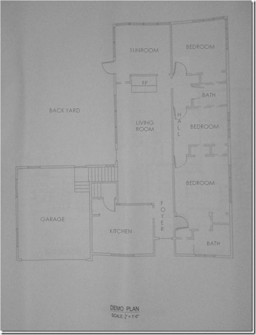
This is a very basic demolition plan of the existing (“before”) interior. It was very choppy and strangely configured. (Please excuse the quality- they’re photos of old drawings for which I know longer have the CAD files)…
This is the new construction and furniture (“after”) plan that I designed…
I’ll cover all the “whats”, “whys”, and specific changes when I address the interior later, but in general, I addressed all the client’s needs and wishes, and then some, with some seriously creative space-planning. This was quite a challenging project, especially given that the center wall running between the left side (living, dining, and sunroom) and right side (laundry, bath, and master) was a load-bearing wall which, for the most part, could not be moved.
This is the board with highlights of the front exterior and the interior foyer…
The door is from Urban Front. They have a wide range of beautiful doors with tons of options…
I loved these white glazed terracotta lions from Italy. I thought they would “guard” the entrance quite nicely and give a hint of what was to come in the fun mix of contemporary and traditional inside…
This is an example of what I meant by center-pivoting windows- located in the front of the house…
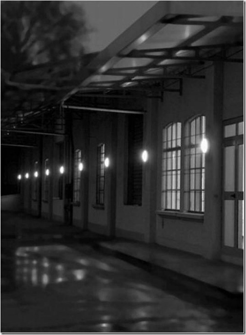
This is an installation image of the Metropoli lighting I specified from DWR (not shown on board, but worth mentioning). You can see them in my drawing, though, of the front exterior- located on either side of the garage door. I used them around the exterior, including over the entertaining deck. I love the soft glow they put off. Quite romantic, I think…
Also not shown on the board, but pretty nifty, are these solar LED lights from CSN Lighting. I specified them to line the walkway up to the front door. They soak up rays all day and then light the way in the evening…
This is the Archetype pendant from Boyd Lighting that I specified for the foyer. I like that it is undeniably stunning, but subtle at the same time. Chic, dainty, and to-die-for…
Here is the Brazilian Walnut from Lumber Liquidators used throughout the home. I have always been a huge fan of this wood. I think the variations in color are so incredibly gorgeous…
And last, but not least, this is the Tech Lighting K-Hello cable track lighting specified to run parallel to her hanging artwork to show it off. The light can be slid up and down the cable, and the lense tilted and rotated for the perfect angle of light…
Up next will be the custom kitchen and dining where I’ll show you a beautiful color palette, unusual artwork you may have never seen before, and some tips for creating big impact while taking up very little visual space and staying flexible for party sizes. Stay tuned!…


No comments:
Post a Comment