The last post I did was of the lady’s master bedroom, with the bathroom located just on the other side of the walk-through closet. I designed this en suite keeping in mind that pretty much every woman “needs” and longs for a big, beautiful, retreat-style bathroom, plus, Susan will be needing a place to wind down after a long day of working, raising a son alone, and undoubtedly dealing with the ins and outs of a divorce. It was pertinent that this bathroom provided her with space, luxury, glamour, and relaxation… The layout above is quite spacious and has all the amenities a woman could want. When you walk in, to your left is a built-in corner storage unit (which could serve as a vanity or extra storage) that is open underneath for a laundry hamper or vanity stool. You then walk between the claw-foot tub sitting in the window alcove and the separate walk-in shower with frameless glass. The toilet isn’t completely enclosed because of space constraints, but has a full wall separating it from the sinks and most of the bathroom. The custom 7’ long sink space offers plenty of storage below and all the wonderful counter-top you could ask for to spread out your makeup and perfume and anything else you wanted. Below is the design board…
Below- I used Benjamin Moore’s Palladian Blue on the walls. The color reminds me of crystal-clear ocean water. The main light fixture in the center of the bathroom is this beautiful 1940’s French nickel and glass flush mount designed by Jean Perzel. In the bottom left is the tumbled white marble used for the floor and counter top- pure, clean, and white- a lovely combination of traditional and modern which is right down Susan’s alley…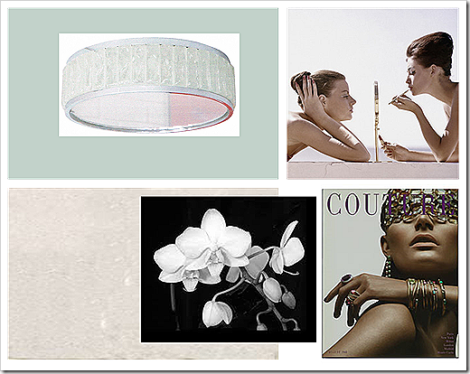 I don’t think many people think of putting nice art work in bathrooms, they maybe see it as a waste. I don’t think it is at all. The bathroom should be treated just as fairly and made to look just as fabulous as every other room in the house. I used a beautiful black and white orchid photo to, along with other special touches, introduce a softness and femininity to the space. And since Susan’s home has a bit of a 60’s flare (reflected in many of the decor choices), I included these great magazine pieces. The one on the top right is from Conde Nast Store entitled “1960s Beauty Secrets” from the April 1960 issue of Vogue. On the bottom right is the cover of Couture Magazine 1968 from ZGallerie. Both of these prints have some really wonderful qualities- they represent beauty and strength, have a softness, are sleek, chic, and totally glam, are very neutral with only colors of white and flesh-tone, and have metal accents found in the mirror and jewelry- which add sparkle and drama…
Below is the elevation drawing of the sink area and corner storage unit(excuse the poor quality- old drawings on big paper which is tough to scan). I actually re-designed the cabinets under the sinks to stretch the entire length for more storage, but it could be done either way… 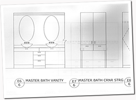
This quick sketch gives you a little bit better idea of the layout from the entrance…
 Above is the sink area’s fixtures and finishes. Clockwise from top left- the Boyd Sala Double Sconces (which cast a nice bright, but subtle, glow with their frosted glass) located on the side walls flanking the mirrors, two oval mirrors from the 40’s with delicate details at top and bottom, modern nickel wall-mount faucets from Kohler’s Purist line, espresso-stained, plain-front cabinetry with nickel Chatham pulls from Restoration Hardware, the tumbled white marble counters, oval glass vessel Ronbow sinks, and the piece de resistance (also found in the shower)- small, tumbled Ming green marble subway for the backsplash.
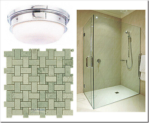
Below is what the shower would look like- with it’s frameless glass (a real dream when it comes to cleaning), that gorgeous Ming green marble again, in a basket-weave this time on the floor and walls, and a nickel Trumbull flush mount from Hudson Valley Lighting…
And the true sanctuary place of the bathroom- the tub. Oh yes…I know you’re sitting there imagining yourself in this decadent soaking vessel, up to your neck in lavender vanilla scented bubbles, with a glass of wine (or hell, maybe even champagne) in your hand with some of your favorite music playing in the background. Nice, peaceful, alone, “you-time”. Well, sorry to interrupt your daydream, but let me finish painting the picture for you… the window draperies are made of Room and Board’s Discover fabric in Spa, the Barcelona stool and all it’s hot curviness is right beside the tub and covered in a sexy white croc (which is vinyl and easy to clean and no problem if it gets wet), and then on the walls at the head and foot of the tub are these charming glass and silvered bird sconces…
Ok, you can go back to your daydreaming… (talltalesfromasmalltown.blogspot)


 Above is the sink area’s fixtures and finishes. Clockwise from top left- the Boyd Sala Double Sconces (which cast a nice bright, but subtle, glow with their frosted glass) located on the side walls flanking the mirrors, two oval mirrors from the 40’s with delicate details at top and bottom, modern nickel wall-mount faucets from Kohler’s Purist line, espresso-stained, plain-front cabinetry with nickel Chatham pulls from Restoration Hardware, the tumbled white marble counters, oval glass vessel Ronbow sinks, and the piece de resistance (also found in the shower)- small, tumbled Ming green marble subway for the backsplash.