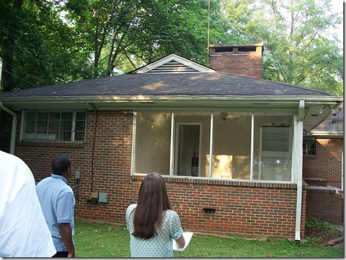
So the last one of these I shared with you was of the sunroom. And just to refresh your memory, here’s what the floorplan of the home looks like…
Before…

(I was free to create a large master suite since adding a half-story over the front part of the house enabled two bedrooms to be moved upstairs.)
You can’t read anything on the above image, but I’ll walk you through where we’ve been so far and you’ll be able to view details of the master suite below. The entrance of the home is at the bottom. You walk through the foyer into the dining room with the kitchen behind you/to the left, open to the dining room is the living area, walk on either side of the double-sided fireplace and you’ll be in the sunroom. (The garage and deck are on the far left, the laundry and powder room are at the front of the house near the foyer.)
A closer view of the master suite just off the living room…
Let me give you a run down of the client and how I approached this design…
Susan was a 40-something newly divorced single mother, with a 10-year old son, who just moved into this fixer-upper. She is a web page designer who has great style and wanted to keep the nice amenities she was used to, even though she was down-sizing. Her taste is traditional with a contemporary edge and since she is starting a new life, she wanted a home that was fun, fresh, slightly feminine, and a great place for entertaining. Knowing Susan would probably be going through some rough days and would be making some major life adjustments, I new it was necessary that her master suite be a mix of light-hearted, girly flair and soft (visually and physically), cocoon-like comfort. It needed to be an ethereal retreat. Women are naturally nurturing and typically drawn to touch and affection, which, I think, is why most of us enjoy soft, silky, and fuzzy things so much. I thought that was a good reason to load this room up with texture.
I also know that going through a divorce and all the stresses it can bring can create a sense of chaos in someone’s life and make them feel as though thev’e lost control, so I felt it important to also create warmth and structure through some hard, straight lines, solid, grounded furniture selections, and warm woods.
I chose a color scheme including a bronzy peach, soft, dusty pink, white, cream, and taupe, with a mix of soft pewter and gold to add a little glamour I new Susan would appreciate.
Example of what the window seat side of the walk-through closet would look like…
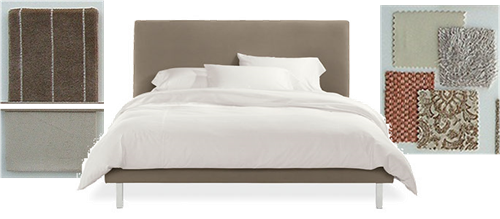
The bed is from Room and Board, upholstered in a pinstripe velvet with a Barbara Barry Velvetina comforter in Flax (left). The throw pillows are a mix of chenille, patent leather, mink paisley, and a soft “eyelash” fabric with a slight sheen creating a lovely and interesting collage of textures(right)…
The nightstands are from the 70’s, selected by Paul Laszlo for the George commission in Beverly Hills. They’re made of Lucite and chrome with a smoked glass top- the perfect blend of masculine and feminine and quite sexy. The alabaster urn lamps are from Italy, ca. 1950’s, and are intricately hand-carved with silk shades- a dreamy, milky color and totally regal. The Kamer chandelier is also from Italy, ca. 1960’s, and composed of gorgeous clear and frosted crystals, giving off a nice soft glow…
The artwork above the bed is Lisa Kowalski’s “Gold Swirls”. It is intended to be hung vertically, but I thought it was just as interesting horizontal. Under the bed is a Mongolian fur rug- trust me, this is a must to put your feet on first thing when you get up in the morning…and right before you go to bed at night. It is the ultimate way to start and end your day- uber softness. Hell, forget the bed, I’d sleep on just that!
I used an embroidered silk in a bronzed peach for window treatments with cartridge pleats at the top. In the corner of the room between the windows I created a sitting area perfect for looking out into the back yard or for reading a book. I used Room and Board’s Bianco chair (which swivels), a vintage Paul McCobb footstool which could double as a side table, a lumbar pillow covered in a beautiful cream and taupe striped silk, and a 70’s Italian Arco lamp- I love how graceful it is…
Between the end of the window and the beginning of the closet cabinets I placed a writing desk that could also be a place for a laptop or used as a vanity if a mirror was added. The art above it is entitled “Summer” by Alphonse Mucha (one of my favorite artists). This piece is the essence of how I wanted the room to feel- soft, relaxed (maybe even a little lazy), beautiful, dreamy, and feminine. Stress-free. You gotta admit, this girl looks like she doesn’t have a care in the world. It hangs above a white West Elm desk, two stunning white ginger jar lamps with brass Asian-style bases, and a lovely 1945 desk chair upholstered in a pewter wool and silk blend fabric with an ebonized walnut frame…
So overall, this master retreat was created to provide a place for Susan to kick off her shoes, unwind, and find peace. A place for her to relax and re-charge after all the challenges of the day, and wake up happy and refreshed, ready to take on a new day. And I think I achieved just that.


I love the layout and the colors, it will be a wonderful cocoon for her !
ReplyDeleteThanks Tammy! I'm not real big on pinks personally, but it certainly suited the client's taste. A lot of people actually think you can't combine white and cream or gold and silver, but you absolutely can. It's good to hear from a fellow busy woman that the room seems comforting!
ReplyDeleteI love the walk through closet plan! This room is going to be gorgeous!!
ReplyDeleteI totally agree about the white and cream and gold and silver. Why should a fabulous woman have to choose just one?? I mix em all the time! Look at us rule breakers!!!
Can't wait to see more.
Hope you're having a great weekend!
Kelle
xx