I’ll start the “before” photo tour standing in the living room facing the front door and kitchen and go 360 from left to right…
Notice the beautiful light fixtures?…
As you can see, the kitchen had two entrances right next to one another, one of which I considered pointless and a waste of space (the smaller one below), so I closed it in to gain a lot more storage…
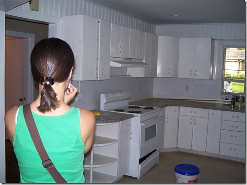
You can see there is one long wall here that is completed wasted as well (never a good thing, especially in a kitchen) and there’s all this floor space that’s not being used either, which is why I planned for an island…
Directly across from the fridge (if your turn facing the other side of the kitchen where the large entrance is) was this odd little tiny pantry space and another entrance/exit to the garage stairs and the upstairs. It was a poor use of space and very disconnected… 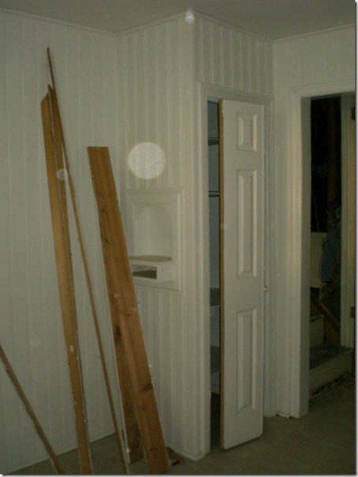
Standing in the kitchen, you can look into the stairwell on the left (next to the old little pantry) and the dining/living room…
New plan!
I…
- closed off the stairwell entrance, moving the door to the garage and opening to the upstairs just outside the kitchen to re-coup even more space (for the cook-top below)
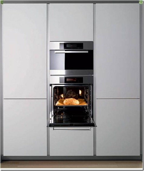
- ran floor-to-ceiling storage all along the right side, complete with a 42” side-by-side fridge and double ovens
- added an island with a wine cooler and bar stools (great place for her son to hang out while she’s cooking)
- that large fabulous window for some much-needed light
- and plenty more storage along the left wall…
On this first elevation drawing, you can see all the great storage I provided. I think floor-to-ceiling storage in a kitchen is a real dream. (I did all of the cabinetry in a high-gloss white on flat-fronts with stainless steel hardware…
Here’s some of what inspired me…
Here in the second elevation (the left wall) you can see the cool horizontal uppers along with some open shelving created from the re-purposed tree out front…
Here’s the inspiration for what I did along this wall…
The tile I specified for the backsplash was this same color green, but in a small, matte subway… 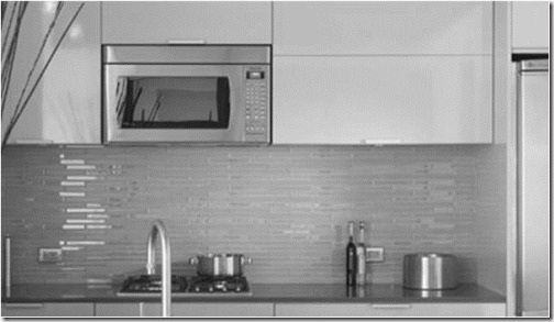
This is the final elevation showing what used to be the garage and stairwell entrance, but now houses the microwave, all-induction cook-top, and bi-fold doors with pull-out shelves for pots and pans…
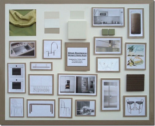
Here is the design board with all the highlights. The color scheme is a creamy white with accents of celery green and mocha…
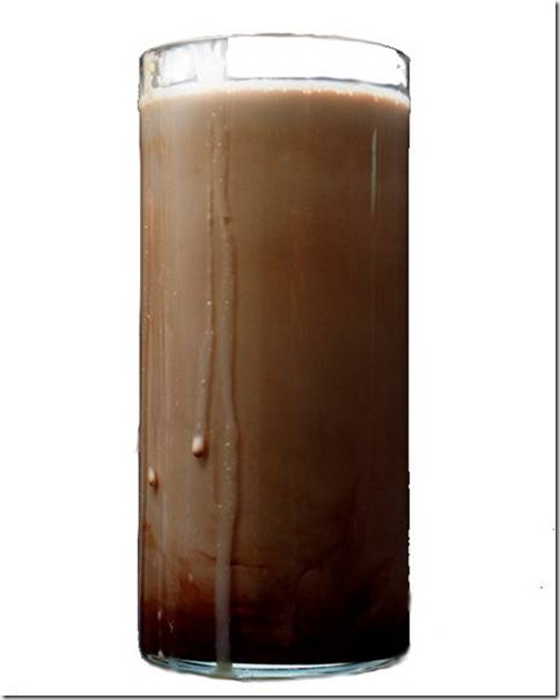
In the top center is the cabinet color and below it, the Silestone counter. On the far right is something fun I came up with for a huge piece of artwork on the wall next to the window. It’s a giant glass of chocolate milk…
Then we have a great piece of art from Conde Nast- a vintage Gourmet magazine cover. Yummy, huh?…
The barstools are 1970’s Pierre Cardin which I had re-covered in a Room and Board fabric in the color Mink…
Over the island is this fun and funky Octopus light from Autoban-De La Espada…
Crazy about the retractable glass vent from Arclinea…
The sink and faucet were by Kohler, the appliances were Viking, Sub-Zero, and Electrolux.
And for the dining area between the kitchen and living room I had to be careful. It was a pretty tight space, so I used an extendable table, clean, no-fuss lines, and clear chairs that would take up very little “visual” space…
I used the chair with arms at the head and foot, and the armless on the sides…
Stayed tuned for the living room!…








Love it. Such a better use of the space.
ReplyDeleteThanks Design Esquire! I thought so, too. :) It was a pretty poor space plan to start with, a fun problem to tackle, and the outcome was a good one!
ReplyDeleteLooks a like a great plan! Love the dining light!!
ReplyDelete