22.9.10

Yes, I’d Like the House but Could You Hold the Frills, Please?


I often think about what I want my “dream house” to be like, as I’m sure most of you do from time to time, and thought I’d share some inspiration images I found that I am in luv with. One thing that I know I’m drawn to is no frills and no fuss. Slick, clean, easy, done. Not to say that I don’t love the charm of the old French-inspired homes of New Orleans or a rustic Spanish-style home complete with clay roof tiles, wood beams, and textured walls, this is simply what I would want my house to look like.

This one is a beach home in Miami, FL. I love how simple and beautiful the structure is. No sloppy brick and mortar, distracting siding, or shingles to repair. That’s refreshing to me. And in sunny Miami, the white reflects the sun, helping to keep the house cool. Striking and practical…

BLOG.SUNNYISLEMIAMIREALESTATE.COM_Miami_Beach_Homes_For_sale(blog.sunnyislemiamirealestate.com)

This one is sooo gorgeous. Black, bold, and beautiful! What makes it even more stunning is how they carried the modern form out into the yard with the long strip of grass, the slab stone walkway and those pure white stones. Black and white- such a sexy, timeless color combo, and it’s a modular house to boot!…  

DIGSDIGS.COM_modular-glossy-black-house-3-554x368 (digsdigs.com)

Although this one is incredibly modern, there’s something about it that is very Zen, too. Maybe because it’s bare-bones-shape isn’t overly fussy and doesn’t look like it’s trying too hard to be something it’s not. It’s not a McMansion with trillions of gables and too many details, there aren’t windowpane grids, shutters, and arches oh my! It simply is what it is.  Aesthetically pleasing, yet very easy on the eyes, giving them a bit of a rest from all the “crazy” houses and cookie-cutter, shoulder-to-shoulder neighborhoods. I even think it’s quite complimentary to and respectful of the nature surrounding it because it doesn’t look like it’s trying to compete for or hold everyone’s attention by being overly and pretentiously grand.

I’m also a big fan of those bean-bag-looking chaises in the yard that look out onto the ocean (this house is on the coast). What more would you need besides maybe a nice glass of wine?…

EXQUISITE-DESIGN.COM_coastal-cottage-design-luxury-glass-stone-7

(exquisite-design.com)

So tell me, what’s your dream house style?

17.9.10

The Magic of Mirrors


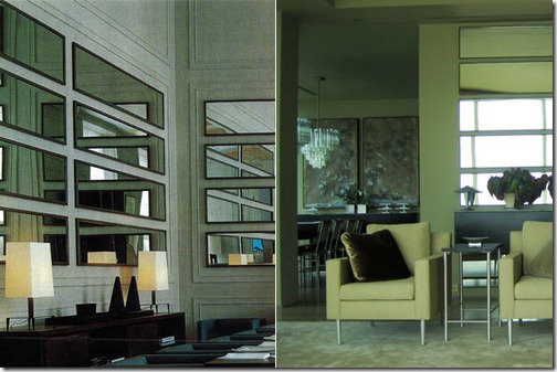
I have always been fascinated by the *magic* you can create in a room simply by using mirrors. The effects this material has, the tricks it can play on the mind, are completely mesmerizing. If done properly and tastefully (yes, mirrored walls can look tasteful), you can perform miracles on a space simply through optical illusion. Let me show you how…

images

If you are selling a home/space, or simply just wanting to enjoy the space you live in (as everyone should), wouldn’t it be nice to give the appearance of double the square footage in a room, or double the fabulous view? Well, you absolutely can do that! The below image on the right was featured recently in Martha Stewart Living. It’s in Kevin Sharkey’s NYC apartment. I’ve been thinking about doing this in a room in my own home across from a wall with windowed doors, but he beat me to it!

Kevin got the idea to do horizontal mirrors from a private Chanel dining room in Paris designed by Karl Lagerfeld. In his apartment, the mirrors reflect the view of the Hudson River and “…transform the view into art.” Fabulous idea. One of the reasons I’ve been thinking about doing this is because you can pick up full-length mirrors at Wal-Mart for about $10 a pop and create this same look simply by hanging them sideways. Now, I’m typically not a fan of design via Wal-Mart because of the cheap quality and look, but it’s just mirror. Used in a creative way like this- no one will ever know- shhh…

THESTIR.CAFEMOM.COM_powr6hg2m8vzcr(thestir.cafemom.com)


Another great way to pull off a mirrored wall is to do it in panels with some sort of additional accent to break it up, like below. Using rosettes, trim, molding, even buttons, you can create a personalized wall that won’t look straight out of the 80’s. I think the rosettes or buttons are nice because they give a softer, almost quilted, look to the wall…

LITTLEGREENNOTEBOOK.BS

(littlegreennotebook.blogspot)


Lastly, one of the number one things that is sure to make a wall of mirrors look great is what is reflected in it. The wall in the image below (from Vogue Living July/August 2006) could potentially look tacky, but the saving grace here is that the pieces it reflects are so beautiful, the full mirroring is much less offensive. Also, the tall, slim lines are very helpful- drawing your eye up and looking more supermodel-esque than typical floor-to-ceiling mirror panels. I’m not sure if this is what’s happening in this particular space, but it being a small one, this would be the perfect opportunity to hide some much-needed storage that could otherwise close in this room. Losing 12-18” in depth along an entire wall in a small apartment is an unthinkable sin, but hide that storage behind mirrored doors that visually give back the other 90-120 square feet, I think that’s a no-brainer, don’t you?

BROWNBUTTON.BLOGSPOT_JULYAUG 06 VOGUE LVG

(brownbutton.blogspot)

15.9.10

Rants and Raves

Rant…

Little front doors try sooo hard to draw attention to the entrances of our homes with their tomato red paint, or maybe a glossy yellow, donning pretty hardware or fancy glass, bright trim, surrounding plants and flowers, and an inviting little welcome mat, as if to say, “Hello? Can you see me? Over here! Hey you! Look, over here!! Hello there & welcome! Come in, come in!” …

DRS2

But try as they may, some just keep disappearing, fading away into the background. “Why?” you ask? Oh, I think you know.

There’s a big ugly bully out there that keeps stealing the spotlight from our “little entrance that could”. It’s the giant vehicle-eating, curb-appeal-devouring, beautiful house-killing garage door.

                             Dum…

                                                                                          Dum…

       Dum!!!

Picture1

Ok, I know there must be a logical explanation for why these big eyesores take center stage on our homes’ exteriors, but from an aesthetic point of view, they drive me crazy. What about you? Does it drive you nuts to see rows of houses where the first and only thing that really stands out is the garage door?


ugdrs

Maybe we should rename the front door, because it certainly isn’t that on all these homes (including my own- which I otherwise adore)…But bravo to all those manufacturers out there making pretty garage doors and the builders and architects who take looks into consideration when planning a house, or at least handle the conundrum in a tasteful way…

btrdrs

I even like the creativity of this garage door on a plane hangar in Florida…

dornob.com_giant-garage-door-home-facade(dornob.com) 

Ok, so maybe it’s a bit much, but it certainly gets the “best think-outside-the-box” award!

So what are your thoughts? Do you wish the front door could be more often restored to its proper place- in front? Do big ugly garage doors bother you like they do me?

8.9.10

LBH New Itinerary!


So I’ve been blogging now since July & I feel like I’m really starting to get into a groove.  This has made me think that it’s time to start organizing my blog like I do my own home- take inventory of what I have & then: everything has its place, everything in its place- so I’ve been planning a little itinerary for the ride I’m going to take you on here at Little Black Home, that is is you’re up for the adventure…

  • Once a month…
    • Where To?
      • Feature places from around the globe & a little taste of design from their world…

WHERE TO MAP 

    • What’s Cookin’ at LBH?
      • Recipes I’m really digging, & I’m certainly no pro- only been tinkering with cooking for about 6 months, actually- so it’ll be things any one of you can pull off- and trust me, these dishes will have your mouths watering!
  • Rants & Raves
    • Hear me rave about what makes my heart go pitter patter & rant about what drives me nutswoman-screaming-300x300


  • Client Fiction
    • You know you all have ‘em- those fantasy celebrity clients whose home (or homes) you’d give an arm & a leg, maybe a kidney, to design. Well, I will be entertaining those fantasies right here by showing you my take on what I think their home style would be based on their personality & wardrobe style...

LISTAL.COM_600full-brad-pitt

(Sorry ladies, that’s as big as I could get the picture to go for you. No smooching your computer screens, please.)


  • You Sexy Thang
    • All those things that undeniably give you serious goose bumps, leave you completely breathless, or maybe even make you say “ohhh yeahhh”- Barry White style- when no one’s around, of course…

MADEMOISELLECHRPHILLIPSTARKE Mademoiselle Chair by Philippe Starck

  • Never Say Never
    • All the things you thought couldn’t be done, done here! Color combos, style mixes, whatever you thought couldn’t work or couldn’t possibly look good- I will show you how. And after each one, as always, the floor is open for any hypotheticals, suggestions, & challenges you can throw at me!
  • Silver Screen Candy
    • Yummy Hollywood set design from your favorite movies & t.v. shows, old & new.
  • Themed VS Inspired
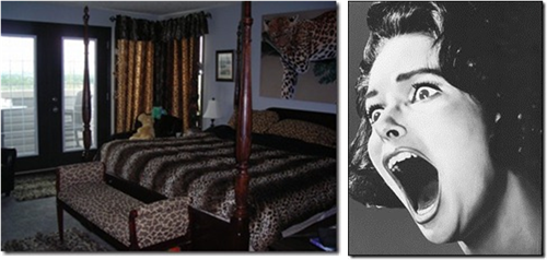
    • How to design a room inspired by something without it looking tacky & just down-right scary…

SCARY ROOM 

  • Sillies
    • Random items & images that will either make you scratch your head or pee your pants.

Until next time!…

3.9.10

Inspiration Room to My Room

Part 3 of 3

I don’t know about you guys, but fabric is something I get *excited* about! All the patterns, textures, colors…so many options! And it’s usually something that can be switched out pretty easily and can completely change the way a room looks and feels. So here we go…

Fabrics and bedding…  

mainbdg   The grey sheet set I already have (from American Apparel). And I have always dreamed of sleeping on silk satin/charmeuse sheets- but they must be silk, polyester is just not cool. No seriously, it doesn’t breathe! The black comforter is from Ikea- just good ol’ plain black cotton. As an ode to my husband’s (and some of my) heritage- an Irish lambs wool cream and grey plaid blanket. Up next is one of my new favorites- Chappuis Granite. a striped, pure silk satin Designer’s Guild fabric. One of the reasons I love it so much is because of the color combo. Since it contains a warmer bronze and a cooler, taupey-er (yes, taupey-er) bronze, it allows you to combine different tones because it’s a “linking piece”. Kind of like a ring that’s two-tone, gold and silver, lets you wear gold and silver jewelry at the same time. Plus it’s silk satin, hello? I think it would be great on a long lumbar or neckroll pillow. The solid black velvet and the pinstripe are both from Lee Jofa, the cool graphic fabric- called Bridgeport in Mushroom- is from Duralee, and that incredible pillow in the center has been an object of my desire for a while now. It’s a gorgeous linen with bronze sequins from ABC Home. It’s a bit pricey at $325, but it’s a 20” x 20” and if I had it, I would love it for ever and ever. One reason I might actually consider purchasing it is because it isn’t a trendy piece necessarily. It would absolutely stand the test of time. And I love it. Like, a lot. 

Now, let’s talk color.

As much as I love the sophistication and timelessness of neutrals, I don’t at all discriminate against colors! They certainly have their place, I just prefer not to commit to any particular color palette because I always find myself wanting to change from day to day and mood to mood (which can be quite often, I am a woman after all). I also think that if you’re going to use color, it should be done in a way that lets it have its moment in the spotlight. Sometimes when you use a lot of color in a lot of places, it can lose its “specialness” and become overwhelming and obnoxious.  Let it stand on its own!

bluplws

From left to right: Kelly Wearstler for Groundworks/Lee Jofa Sora Velvet in Aqua/Blue, Groundworks Tribeca Weaves Loft Silk in Aqua, & Andrew Martin at Lee Jofa Sanchez in Bluel…   grnplws

From left to right: Duralee Bridgeport in Pistachio, Holly Hunt Great Plains- Greens in Clover, & Jamie Drake for Schumacher- Not Square in Lime Rickey…

Now to mix it up…

mixblu

Who said you couldn’t use black and blue together? I think it's stunning! What do you think?

mixgrn

mixblgr

See how you can bring in a little color and it gives you so many options? And doing them in pillows, especially in the bedroom, means if you wanted to change colors, patterns, or styles, you easily could and you wouldn’t have to replace all your bedding, paint the walls, or re-upholster anything. It’s smart, no? Word of caution, though: For those with male sleeping partners- they don’t typically care for lots of unnecessary pillows and quite frankly, I have to side with them on this one. They may look pretty, but who wants to undo the bed for 10 minutes before you get into it? Not me. I’d keep it to about 3 or 4 throw pillows and then do just that with them.

Grand Finale…

NEUTRALAll neutrals…


COLOR  With color…

So what do you think? I’d love to know!

2.9.10

Inspiration Room to My Room

Part 2 of 3 

**Be sure to see the post located below this to check out my first guest post @ Strictly Simple Style!**

Picture2 These chairs, which belonged to my grandmother, are in storage right now. I have been itching to give them some much-needed TLC. Right now they look like they should be slathered onto a hot dog bun because one is a mustardy yellow, the other a bright red. I really only need one of them in my master bedroom, though…

Picture3 My plan is to cover the back only in a cowhide- if the size is right, I’ll get this rug from World Market and use it- and the rest in either Edelman Cashmere Calf Super White leather or a white denim (depending on budget) and use silver nailhead. The chair has good feminine form, the nailhead is modern and masculine, the white is chic and beautiful, and the cowhide, a little rustic-an altogether sophisticated look, I think. What about you?…

Drapery…

curtainsThe panels on the bottom left I purchased at Target for about $12 for the pair (they’re actually more grey than they appear here, like a dark taupe). I got them because they were on sale (I’m such a girl) and I loved the color. I don’t, however, love the rod pocket- it looks cheap to me (probably because it was)- so I’ve decided to cut the top off and add a border in black dupioni silk all the way around and instead, hang it with rings on a brushed nickel rod from West Elm. I think this is a great way to take something inexpensive and jazz it up a little…

Lighting, art, and accessories…

ltg and access.Shiny, matte, wood, lambs wool- a textural wonderland, my friends. And a sure fire way to create interest and character in a room.

The pyrite (fool’s gold) use to be available at Anthropologie, but can be found other places. Bedside lighting- Ikea’s Antifoni work lamp. A must have- super soft lambs wool rug under the bed- steppin’ on that in the morning would be a great start to any day! The candle holder is from Crate and Barrel. The carved wooden cross is from Tres Amigos World Imports…

artI would love to have this lion photograph blown up and put over my bed (photo via pictures from earth)! The two astrological prints, Scorpio for my hubs and Virgo for me, are to prop on the desks against the wall on either side of the bed. The black snakes are waaay cool, I think- amazing photography by Parisian artist Guido Mocafico via room101cigars. I’ve been wanting to try my hand at painting and might would create a tall piece similar to the one shown (which is actually much shorter- I just stretched it for demonstration). I’d even like to build some sort of hinged “box” that could hide a place to hang all my jewelry behind the art, using the concept below…

DESIGNSPONGEONLINE.COM_katefinalhidden (via designsponge)

As always, I’d love to hear your thoughts! Make sure to check in tomorrow for Part 3, my favorite- fabrics! I’ll show you how I pull color into a room…

**Be sure to see the post below and check out my first guest post @ Strictly Simple Style!**

1st Guest Post @ Strictly Simple Style!


Hey guys and gals! Thought you might like to know that I will be guest posting today for Karen Evans @ Strictly Simple Style. Karen is dealing with a serious illness in her family and asked me if I would give some tips for decorating on a budget to help her fill in a little. Of course, I was happy to do so! Karen has been so friendly and helpful since I’ve started my blog and I always enjoy visiting her site because it helps get my gears turning with all the creative ideas shared by her and her readers. As a matter of fact, here’s one I will be doing my own take on for the upcoming fall season…

 SSS_miscellaneous_home_projects,_pumpkins_040[1] SSS_miscellaneous_home_projects,_pumpkins_056[1] (Click images to go to blog page)

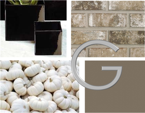
Karen’s pumpkin topiaries and nail-head pumpkin. Luv it! Here’s my take…


Picture1Glossy black square planter to hold stacked white pumpkins with stainless steel nail-head in a modern “G” (for Griffin) against my front door (painted in Benjamin Moore Fairview Taupe) and Boral Ortega bricks. Not bad, eh?    

Thanks for inviting me to guest post, Karen, and for all the great inspiration that can be found on your blog! As always, my thoughts and prayers go out to you and your family.

1.9.10

Inspiration Room to My Room

Part 1 of 3

In my last post I mentioned that I would be putting together a “dream board” for my bedroom. I also said that the below image was exactly what I wanted my bedroom to look like. So gaining inspiration from that picture, I have created a room design to share with you. Enjoy!

*Keep this in mind: Being a designer myself, I am very much against duplicating people’s work. I believe inspiration shouldn’t be about copying, but more about finding things that create a spark inside you, using whatever that is as a jumping off point, and running with it to create a design that is personal to you!*

Inspiration photo…

paint These are the Ralph Lauren paint colors I’m considering. Which do you like best or do you have another suggestion? I’m all ears…

My existing furniture and accessories…

existing Ikea Malm bed and nightstands…

Picture1  On my nightstand you will always find one of life’s main necessities- no, not water, silly- my Crackberry. Alongside it is a brass cobra and a carved wooden coaster- both from India, and a white porcelain lotus bowl…

 Picture2 On my husband’s nightstand (once I’ve shoved all his stuff in the drawer- sorry, love) is a hand-me-down lamp and a beautiful mixed metal lion he got in Afghanistan while serving in the Army. All these accessories are keepers, as far as I’m concerned…

Additional furniture…

tblcombo Because bedside tables low to the floor (and I do mean low) just wouldn’t fly for us, I want to layer this West Elm mini-parson’s desk (or maybe something similar, if I could snag a great thrift store deal) with our existing nightstands- giving us extra surface-space and storage. Who doesn’t need that, right?

So what do you think so far? I’d love to know your thoughts! Stay tuned tomorrow to see the fabulous makeover plans I have for an old chair that use to live in my grandmother’s house…