8.7.11

There’s No Place Like Home: A New Beginning…


So when I finally arrived in Tampa a week after my husband, I was faced with the somewhat daunting task of putting our townhouse together. My poor husband literally had a suitcase of about a week’s worth of clothes (all dirty at that point), basic toiletries, and leftover pizza in the fridge. He said to me one of the first nights I was there (in a non-complaining, more “homesick”-type of way) that he felt unsettled; that it was stressful to come home and see all the many, many boxes- our entire life, packed away- and no wife. He said it just didn’t feel like our “home”. I felt bad for him. He’d been working so very hard, basically building this new part of the company from the ground up, and he was exhausted to say the least when he came home. Yet another point in my life where I realized the importance of home. I knew I needed to create order from chaos and turn this place into something that felt comfortable, restful, and familiar to him (and to my two cats, Butters and Sam, who had been camping out in their carriers, afraid to come out)…Picture1

(a “box cave” I made them which they took to right away)


So I rolled up my sleeves and started right away- climbing two sets of stairs in our tri-level townhouse, up and down, up and down, every day, unpacking boxes and trying to snap the place into shape (along with my calves and hamstrings). After getting some basics pulled together- my husband’s clothes, the bathroom, the kitchen, and laundry detergent- I started home-making. First things first: the foyer.

Everyone knows how important the entrance of a home is. It’s your first impression of the place. If it looks bad and is dysfunctional, that sets a bad tone for the entire home… and you’d be surprised how it can affect you mentally and even physically. (Not to get all feng shui, but coming home after a long day at work, opening your front door and seeing a mess, bumping into things, not having a place for your stuff- this can keep your stress level high, raise it, and even affect your mood and blood pressure. Something to think about… definitely not the effect you want your home to have on you and your family.)

So let’s get this place off to a good start,” I thought. The first level of our townhouse-turning-townhome is a “bonus room” (which we made into the office) a foyer, a small storage room, and a garage/laundry space. As you can see below, the foyer doesn’t lend itself to many grand, beautiful design options. With two main entry doors and their swing space to consider, I was presented with a bit of a challenge. But that’s fine by me. I love design challenges. And small spaces can be much more charming than stuffy, vast vestibules…CCI07082011_00001

(foyer is about a 5x6 space with the doors closed)


So, I make my list…

  • place for keys
  • place for sunglasses
  • more light
  • much more light
  • place for other small items (change, pocket lint, random weird things that make their way into your pockets)
  • place to set mail

And as I would soon learn after lots of rain and several trips to the beach…

  • place to put dripping umbrella
  • place to put dripping towels
  • a buffer zone for the many pounds of sand we somehow manage to carry home on our persons
  • place for sandals- also filled with lots and lots of sand

Very short on space with a very tall order to fill.

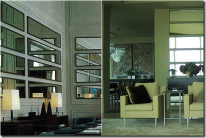
So after deciding that I couldn’t just turn my foyer into a giant sandbox and call it a day, I came up with my plan. I started by making the decision to put up mirrors horizontally…

Picture2  (thestir.cafemom.com)

Kevin Sharkey’s (of Martha Stewart Living) NYC West Village Apartment (right) inspired by Karl Lagerfeld’s design of the Chanel private dining room in Paris (left)


Picture4(Vicente Wolf)


Picture3

(from InStyle magazine on apartmenttherapy.com)


I think it’s such a cool look and I needed mirrors to make as much of the existing (or should I say non-existing) light as possible. I also knew it would help it not feel so crammed, like you just opened a door into a wall…

Picture16 (there is just that one sad little ceiling light for the whole entry and office space- which I was standing in to take the pictures)

I already had these $5 door mirrors, but the last thing I wanted was to put a bunch of dark items down in the already dungeon-like room (the dark table I used is a antique, so it had to be left that color), so I spray painted the mirrors white…foyer


And here is the result…

Picture9 On the right- a carved wooden hanging thingy from India. On it now are an old hat and walking canes that belonged to my late granddad, but perfect for hanging umbrellas (which can also be propped in the corner) and towels to drip dry onto the tile floor. The basket is for sandals and flip-flops. The perfectly-sized antique table has a wooden bowl for keys, etc., a porcelain lotus bowl which I filled with spearmint lifesavers for cool, refreshed breath coming in or going out, and a vase filled with dried grass from Brazil. Everything I needed.


Picture12 The grass introduces something organic as does the wood (which I love to mix) and the woven basket. The bowls, vase, and table base add some much-needed curves. And I opted for a clear glass vase because, since it needed to be kind of large to hold the grass and have some presence, it would’ve seemed too heavy in a solid color.


Picture13

Picture15

Picture17( And as you can see, the mirrors multiply the little light that is there.)


One thing that didn’t work out perfectly was- I ordered a rug with tassels that ended up being too fat for the doors to pass over. I ended up moving it to my kitchen, but I’m debating on whether to go sans-rug, just do a rug in the office space to define the two areas, or give it another shot. I’m considering using a beautiful Turkish hammam towel. I get my tassels (which I’ve been obsessed with having for some reason), some subtle pattern, and when it gets dirty, I can throw it in the wash.

Picture18

Opinions? Thoughts? Ideas? Suggestions?

Stay tuned. I’ll be posting about the adjacent office space soon!

30.6.11

There’s No Place Like Home: Part II


noplacelikehome

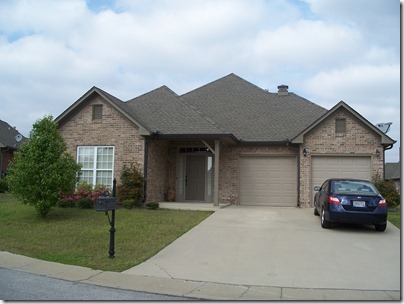
You know, Birmingham never really felt like “home” to my husband and me. We were always (and still are) very thankful for our house there (especially since we’d previously lived in a 350 square foot studio with a murphy bed), but we always planned to eventually move somewhere different, so it always felt temporary- like an “in-between-here-and-there” kinda place. Because of that, (and the fact that we were moving to a place with beaches and palm trees) I thought that leaving the old place would be a breeze and that we’d have no emotional attachment whatsoever. It was just a house to us, a cute little cookie-cutter house. That’s all. Nothing special. Boy was I wrong…

100_5120

As moving day neared, I felt myself getting strangely emotional. “What in the name of Jesus is this about? Am I really sad about leaving this place??” I asked myself. “Surely not. We’ve wanted to move to Florida for a while now and we’re excited! Beaches! Palm trees! I must just be anxious and wound a little too tight with all that’s going on…” After convincing myself I wasn’t sad about leaving this house, I decided to go through and take pictures and video of it, just so we’d remember what it looked like. Oh yeah, and because I am a mushy, sentimental sap. But seriously, this was our first house together. I’m actually getting a little choked up now just thinking about it…

As I walked through, I thought about all the things that had happened in that house. The fights, the laughter, the happiness, the chasing of cats with squirt bottles…

wet-catnikkigsblog.wrdprs

(nikkigsblog.wordpress)

(It’s fun. Really. Try it next time your cat misbehaves.)

I remembered carving jack o’lanterns together and setting them on the porch to greet all the little trick-or-treaters…Photo0317_001

the rare snows we saw and played in (ok, that I played in)…snow

(me. in the snow. with blonde hair. very excited. people get that way about snow in Alabama…)

the stupid boobie lights that I hated and never got the chance to replace…

image 

(told you they looked like boobies. big ol’ lit up boobies…)

I thought about the Christmases we spent there, the hauling in of the tree we’d cut down ourselves, the cursing as my husband tried to get it upright in the stand and to stay that way. The fun we, no…I, had putting up decorations and how my wonderful, patient, understanding hubs learned to let me do the bow on top of the tree, flouf it, straighten the lights, and make sure all the ornaments were evenly spaced and balanced (because I’m anal like that). I remembered the walks we took through the neighborhood,…100_5130 100_5132

grilling all summer long while having a few beers and watching the game, my poor little dog dying and the morning my husband told me and held me as I cried,…image 

and the night my husband proposed to me in the living room on our old red sofa and how surprised I was. You know, I went from someone who was afraid to chop strawberries to someone who is passionate about cooking in that kitchen. I taught myself how to cook there. And that wacky fridge of ours- I remember the night the freezer door went crazy and started shooting ice and peeing water everywhere… even after my husband unplugged it! Life happened in that house- good and bad - and over a fairly short period of time, without us really realizing it, that house had become home. It was never our intention to get so attached to that place, we certainly didn’t expect that we ever would, but we shared a lot in that house, we grew together in that house, we fell deeper in love with each other in that house, and that, my friends, made it special. That made it home. And it wasn’t until we started to leave it that I realized how much it really meant to us.

The last morning there with my husband, a couple of suitcases and an air mattress, as he was getting ready to leave, he snapped a picture of us and titled it “last morning at the house”. It’s one of my favorite pictures of us, even if my nose was all red and my eyes a little puffy. I stayed a week to supervise repairs and so on, and on my last day there, after I’d said all my goodbyes to my family, I drove back for one last look and it had started to rain. I cried like a baby. I was really excited about moving to Florida and I certainly missed my husband, but I was/am really going to miss our first house, our first home.

I drove ten hours by myself to Tampa and rejoined my husband and our new townhouse of boxes. When I talked to him later about it and told him how I hadn’t expected to get so torn up inside, he admitted to having gotten a little emotional himself when he drove away that morning (and trust me, that’s very unusual for him). He said he even teared up just a little. But after I cried a little as we sat on the sofa in our new apartment, talking about the old house, I realized it was less about the actual shell of the house, and more about the memories and experiences that made it home. So as we embark on this new journey here in Florida, I will enjoy turning our new place into a home. A nice, beautiful, comfy home…

homeswthome


22.6.11

There’s No Place Like Home: Part I


In one of my first posts, A Style to Call My Own, I talked a little about the role that “home” plays in our lives. Understanding the vast importance of home is one of the things that drives me to help people turn their house shell into a place of beauty, function, comfort, and meaning. Just stop for a moment and think about what “home” is to you and your family. Think about all the experiences you’ve shared and the memories you’ve created. What would life be like without home? How would things be if you didn’t have that refuge to come back to at the end of the day? If you hadn’t had it growing up? The significance of the home has really been on my mind lately and I just wanted to share with you how that comes into play with why I love doing what I do and why I feel so strongly about it…why it’s so important and so valuable.

hiwthi  (home is where the heart is sterling silver necklace from etsy shop JDavis Studio)

As you all know, I just moved from Birmingham, AL to Tampa, FL. Like I mentioned in my last post, my husband left a week ahead of me. Well, the morning he left was the day the tornadoes started that wrecked so many lives. It was a terrifying experience, to say the least. Crunched in a downstairs bathroom with my parents and one of my brothers, we watched the radar on our phones, listened to the weatherman, and texted and called friends and family back and forth, making sure everyone was still ok as we watched this mile-wide monster tear through our cities. For the next week or so we spoke with people we knew and watched the local news, hearing stories of loved ones who were injured or dead and homes that were completely gone. Thankfully, my family and their homes made it through safely, but it is really overwhelming and heart-wrenching to see what so many others are going through.

chrlstnsqr (Here’s a photo of my old apartment in Tuscaloosa- I lived on the second floor. You can see the actual apartment space I lived in, with only a floor and a couple of walls left standing. In the center is the pool and what used to be where I did laundry.)

It’s times like these where it really hits you just how much our lives revolve around home. Home is everything. It’s where we live, love, and learn, where we share the good and bad, the ups and downs. Home sees our blood, sweat, laughter, and tears. It’s where we learn to cook or teach others how, where we have big family meals or intimate dinners for two. It’s where we go through pregnancies and bring home brand new little ones, where we raise them and watch them grow into adults, all creating memories together. It’s where children will remember finding comfort after their first day of school, having their heart broken, and getting the chicken pox, it’s where they will remember sharing their joy after making straight A’s, being asked to prom, and getting their driver’s license. Home is where we want to be after a bad day or after receiving bad news, where we want to be when we’re sick, it’s where we feel safest and happiest, where we create memories with friends and family, memories that shape our lives…

home

Home is where our lives are centered. It’s where we recharge, where we want to be, where we experience true, unconditional love, support, and comfort. Think about it- When you’ve been on a long trip, what’s the first thing you think on the way back? I can’t wait to be home. When you’re stuck in 5 o’clock traffic? I can’t wait to be home. When you’ve had a long, hard day at work? I can’t wait to be home. When you’re recuperating from surgery in the hospital? I can’t wait to be home. When you’re fighting a war overseas? I can’t wait to be home. Hell, with most soldiers, home is the only thing that keeps them going. It’s what they live for, what they fight for, and what some die for…

military


These are the reasons I do what I do. It’s so important to me to help people create beautiful, functional, comfortable homes so that everyone who is there will always want to be there and always want to come back. I enjoy helping people create a place where cherished memories can be made. What a wonderful thing to be able to do for someone! I want people to feel wrapped in joy and warmth from the moment they step inside, and I want that to be a feeling they attach to home and carry with them always. Home is the foundation for living and it should be a haven for you. It’s vital that it work for you and with you, that it be all that it can. It should cradle you like a mother does a baby when you desperately need comfort, it should support you when you’re busy and stressed, uplift you when you feel run down, and be a place of joy and happiness that you can always count on.

I have my own fond memories of home, as does the rest of my family; my husband has his fond memories, as does the rest of his family. I’ve seen people’s homes wiped from existence and seen the devastation, the pain, and the hopelessness that it causes. I’ve seen the anxiety followed by delight in people who just finished having a brand new home built. I’ve experienced the sadness of leaving one home, and the joy of creating a new one. I believe in the power of the home. It’s a place that is truly precious and sacred. That’s what makes what I do so fulfilling and so valuable. You see, for me, designing homes is about so much more than just making things look pretty. It’s about working with you, understanding you and your family’s lives, your wants, your needs, your goals and your dreams. It’s about helping you create that place that will forever be near and dear to your heart and the hearts of your loved ones, helping you mold and shape a house into a wonderful place, a place that is and will become a very important part of your life, a place you call home.

*After you read this, say a little prayer/keep in your thoughts the people who have lost their homes in the recent natural disasters and then take a moment to really appreciate your own home and what it means to you and your family.*

8.6.11

I’m Back!


Whew! It’s been a crazy ride over the past couple of months… My husband went ahead of me to meet the movers and get his big new job started in Tampa while I stayed behind to run the circus of workers beautifying the house (so it could be put on the market) and tie up all loose ends. It felt chaotic- being apart, trying to process such a huge life change, and everything happening so fast- but thanks to some good planning on our part, in reality, it went fairly smoothly.

Now we’re here in our new hometown, and after weeks of unpacking boxes and getting things in order, we are starting to feel a little more settled and at peace. We’re living in a townhouse while we learn the area so we can start looking for a house- yay! And I must say, I am really enjoying being so close to sand and surf, tons of great new restaurants (and fresh seafood!), the beautiful weather, and big design opportunities!

fl

Although I don’t feel at home quite yet, I know it will come, and I am so excited about building my design business here! (So if you know anyone that needs some help, hook ‘em up with my blog and email address listed on my profile!)

Florida is such a beautiful and inspiring place, especially for someone like me who loves to incorporate nature and a crisp, fresh feeling into their home. (I have already started a seashell collection!)

Picture1

(top two room photos are of India Hicks’ home in her book Island Life; bottom, left to right- etsy shop leapinggazelle- glass bottles photo, room from Kelly Wearstler’s The Tides South Beach resort, and unknown)

Over the past couple of months some things have happened that have really inspired new topics for me to write about and discuss with you, but for today, I just wanted to hop back in and let you know it’s back to blogging for me in my new home of the sunshine state! Can’t wait!

sunshine

18.4.11

LBH is Relocating!


Not the blog, just the author. In case you haven’t noticed, I haven’t been posting much lately. My husband was recently promoted and now we are being relocated. This has been in the works for a little while now, so we’ve been busy little bees doing research and making all the necessary plans for the big move and we couldn’t be more excited!!  We are selling our current home and moving to Tampa!

ct_greetings_florida

I have been, as my granddad used to say, “running around like a chicken with my head cut off”! Between house purging, planning, repairing, planning more, flying there to find a new home in two days and then flying back, etc., etc., I am just about beat. So for probably the next month, I will be absent from my blog, but hope to be back by June to tell you all about it! (I have never made a move this big and never lived near beaches and palm trees! Sooo excited!!!) All of you take care and maybe the next time I post, it will be from the beach under a palm tree…

beach_hammockP.S. If anyone has any tips on moving/relocating, etc., please share! Thanks you guys and wish us luck!

9.4.11

Design Show and Tell: Lady’s Master Bath


The last post I did was of the lady’s master bedroom, with the bathroom located just on the other side of the walk-through closet. I designed this en suite keeping in mind that pretty much every woman “needs” and longs for a big, beautiful, retreat-style bathroom, plus, Susan will be needing a place to wind down after a long day of working, raising a son alone, and undoubtedly dealing with the ins and outs of a divorce. It was pertinent that this bathroom provided her with space, luxury, glamour, and relaxation…CCF10142010_00001The layout above is quite spacious and has all the amenities a woman could want. When you walk in, to your left is a built-in corner storage unit (which could serve as a vanity or extra storage) that is open underneath for a laundry hamper or vanity stool. You then walk between the claw-foot tub sitting in the window alcove and the separate walk-in shower with frameless glass. The toilet isn’t completely enclosed because of space constraints, but has a full wall separating it from the sinks and most of the bathroom. The custom 7’ long sink space offers plenty of storage below and all the wonderful counter-top you could ask for to spread out your makeup and perfume and anything else you wanted. Below is the design board…


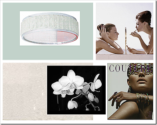
Below- I used Benjamin Moore’s Palladian Blue on the walls. The color reminds me of crystal-clear ocean water. The main light fixture in the center of the bathroom is this beautiful 1940’s French nickel and glass flush mount designed by Jean Perzel. In the bottom left is the tumbled white marble used for the floor and counter top- pure, clean, and white- a lovely combination of traditional and modern which is right down Susan’s alley…Picture1I don’t think many people think of putting nice art work in bathrooms, they maybe see it as a waste. I don’t think it is at all. The bathroom should be treated just as fairly and made to look  just as fabulous as every other room in the house. I used a beautiful black and white orchid photo to, along with other special touches, introduce a softness and femininity to the space. And since Susan’s home has a bit of a 60’s flare (reflected in many of the decor choices), I included these great magazine pieces. The one on the top right is from Conde Nast Store entitled “1960s Beauty Secrets” from the April 1960 issue of Vogue. On the bottom right is the cover of Couture Magazine 1968 from ZGallerie. Both of these prints have some really wonderful qualities- they represent beauty and strength, have a softness, are sleek, chic, and totally glam, are very neutral with only colors of white and flesh-tone, and have metal accents found in the mirror and jewelry- which add sparkle and drama…   

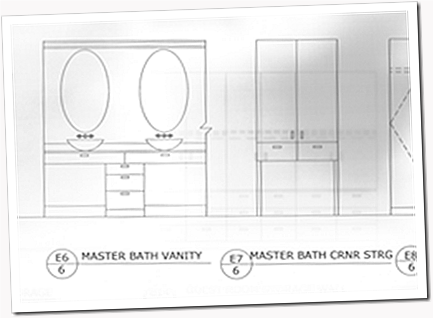
Below is the elevation drawing of the sink area and corner storage unit(excuse the poor quality- old drawings on big paper which is tough to scan). I actually re-designed the cabinets under the sinks to stretch the entire length for more storage, but it could be done either way…  bath

This quick sketch gives you a little bit better idea of the layout from the entrance…mbath


Picture3Above is the sink area’s fixtures and finishes. Clockwise from top left- the Boyd Sala Double Sconces (which cast a nice bright, but subtle, glow with their frosted glass) located on the side walls flanking the mirrors, two oval mirrors from the 40’s with delicate details at top and bottom, modern nickel wall-mount faucets from Kohler’s Purist line, espresso-stained, plain-front cabinetry with nickel Chatham pulls from Restoration Hardware, the tumbled white marble counters, oval glass vessel Ronbow sinks, and the piece de resistance (also found in the shower)- small, tumbled Ming green marble subway for the backsplash.
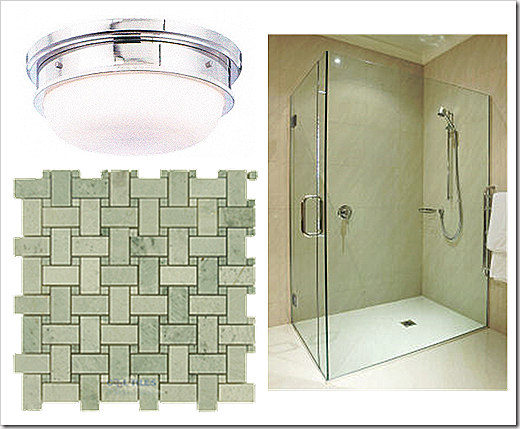
Below is what the shower would look like- with it’s frameless glass (a real dream when it comes to cleaning), that gorgeous Ming green marble again, in a basket-weave this time on the floor and walls, and a nickel Trumbull flush mount from Hudson Valley Lighting…Picture4   

And the true sanctuary place of the bathroom- the tub. Oh yes…I know you’re sitting there imagining yourself in this decadent soaking vessel, up to your neck in lavender vanilla scented bubbles, with a glass of wine (or hell, maybe even champagne) in your hand with some of your favorite music playing in the background. Nice, peaceful, alone, “you-time”. Well, sorry to interrupt your daydream, but let me finish painting the picture for you… the window draperies are made of Room and Board’s Discover fabric in Spa, the Barcelona stool and all it’s hot curviness is right beside the tub and covered in a sexy white croc (which is vinyl and easy to clean and no problem if it gets wet), and then on the walls at the head and foot of the tub are these charming glass and silvered bird sconces…Picture2

Ok, you can go back to your daydreaming…image (talltalesfromasmalltown.blogspot)

25.3.11

Design Show and Tell: Lady’s Master Bedroom


So the last one of these I shared with you was of the sunroom. And just to refresh your memory, here’s what the floorplan of the home looks like…

Before…Picture1

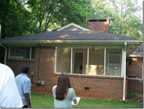
100_1964Viewing from the rear of the house, the sunroom is on the right, the master on the left. I took out the little window in the master bedroom and replaced it with a floor-to-ceiling window that goes around the corner (like what’s done in the sunroom), letting in as much natural light as possible.

After…image

(I was free to create a large master suite since adding a half-story over the front part of the house enabled two bedrooms to be moved upstairs.)

You can’t read anything on the above image, but I’ll walk you through where we’ve been so far and you’ll be able to view details of the master suite below. The entrance of the home is at the bottom. You walk through the foyer into the dining room with the kitchen behind you/to the left, open to the dining room is the living area, walk on either side of the double-sided fireplace and you’ll be in the sunroom. (The garage and deck are on the far left, the laundry and powder room are at the front of the house near the foyer.)

A closer view of the master suite just off the living room…CCI03222011_00000Because of the shape of the house and the load-bearing wall that ran the length of the main part of the house, I was not able to have a true walk-in closet in the master... there just wasn’t enough room width wise. Knowing, though, how important clothing storage is in a master, especially for a single woman, I created what I call a walk-through closet. It consists of floor-to-ceiling espresso-stained walnut cabinets, drawers, and a window seat. Along the left wall is about 4’ of single-hanging rod for dresses, coats, etc., and 4’ of double-hanging rod. Along the right wall are upper cabinets (about 4’ wide each) with adjustable shelves and drawers running across the bottom (about 12’ total), continuing under the window seat, for shoes, hats, undergarments, etc. (All of the details can be seen in the images below.)

Let me give you a run down of the client and how I approached this design…

Susan was a 40-something newly divorced single mother, with a 10-year old son, who just moved into this fixer-upper. She is a web page designer who has great style and wanted to keep the nice amenities she was used to, even though she was down-sizing. Her taste is traditional with a contemporary edge and since she is starting a new life, she wanted a home that was fun, fresh, slightly feminine, and a great place for entertaining. Knowing Susan would probably be going through some rough days and would be making some major life adjustments, I new it was necessary that her master suite be a mix of light-hearted, girly flair and soft (visually and physically), cocoon-like comfort. It needed to be an ethereal retreat. Women are naturally nurturing and typically drawn to touch and affection, which, I think, is why most of us enjoy soft, silky, and fuzzy things so much. I thought that was a good reason to load this room up with texture.

I also know that going through a divorce and all the stresses it can bring can create a sense of chaos in someone’s life and make them feel as though thev’e lost control, so I felt it important to also create warmth and structure through some hard, straight lines, solid, grounded furniture selections, and warm woods.

I chose a color scheme including a bronzy peach, soft, dusty pink, white, cream, and taupe, with a mix of soft pewter and gold to add a little glamour I new Susan would appreciate.

Design board…mstr ste

Example of what the window seat side of the walk-through closet would look like…image

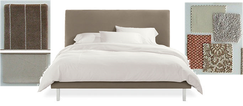
The bed is from Room and Board, upholstered in a pinstripe velvet with a Barbara Barry Velvetina comforter in Flax (left). The throw pillows are a mix of chenille, patent leather, mink paisley, and a soft “eyelash” fabric with a slight sheen creating a lovely and interesting collage of textures(right)…

Picture2

The nightstands are from the 70’s, selected by Paul Laszlo for the George commission in Beverly Hills. They’re made of Lucite and chrome with a smoked glass top- the perfect blend of masculine and feminine and quite sexy. The alabaster urn lamps are from Italy, ca. 1950’s, and are intricately hand-carved with silk shades- a dreamy, milky color and totally regal. The Kamer chandelier is also from Italy, ca. 1960’s, and composed of gorgeous clear and frosted crystals, giving off a nice soft glow…

Picture8

The artwork above the bed is Lisa Kowalski’s “Gold Swirls”. It is intended to be hung vertically, but I thought it was just as interesting horizontal. Under the bed is a Mongolian fur rug- trust me, this is a must to put your feet on first thing when you get up in the morning…and right before you go to bed at night. It is the ultimate way to start and end your day- uber softness. Hell, forget the bed, I’d sleep on just that!

Picture7

I used an embroidered silk in a bronzed peach for window treatments with cartridge pleats at the top. In the corner of the room between the windows I created a sitting area perfect for looking out into the back yard or for reading a book. I used Room and Board’s Bianco chair (which swivels), a vintage Paul McCobb footstool which could double as a side table, a lumbar pillow covered in a beautiful cream and taupe striped silk, and a 70’s Italian Arco lamp- I love how graceful it is…

Picture9

Between the end of the window and the beginning of the closet cabinets I placed a writing desk that could also be a place for a laptop or used as a vanity if a mirror was added. The art above it is entitled “Summer” by Alphonse Mucha (one of my favorite artists). This piece is the essence of how I wanted the room to feel- soft, relaxed (maybe even a little lazy), beautiful, dreamy, and feminine. Stress-free. You gotta admit, this girl looks like she doesn’t have a care in the world. It hangs above a white West Elm desk, two stunning white ginger jar lamps with brass Asian-style bases, and a lovely 1945 desk chair upholstered in a pewter wool and silk blend fabric with an ebonized walnut frame…

Picture10

So overall, this master retreat was created to provide a place for Susan to kick off her shoes, unwind, and find peace. A place for her to relax and re-charge after all the challenges of the day, and wake up happy and refreshed, ready to take on a new day. And I think I achieved just that.