Just got back this week from vacation…sad that it’s over, but glad to get back to my blog!
This living room was one of the biggest challenges of the home, as I mentioned before. It was long and skinny, which posed several issues for furniture layout and traffic flow. However, it did have some great features to work with.
I love the fireplace. The white painted stack stone is a great focal point which can be seen from the dining room and kitchen, through the big window from the deck (which I added), and as soon as you walk through the front door. It adds great texture and a little fun to the space, making it less formal and more lighthearted and modern…
This shot is facing the kitchen from the fireplace. Where the two people on the right are standing is the dining area…
I actually left these ledges on the wall. I love that they sort of disappear into the other stone, giving the illusion that whatever is sitting on them is floating. I also added down lights to highlight the depth and texture…
So here are the changes I made…
I was able to push back part of that load-bearing wall which gave me a walk-through space necessary for good traffic flow. This allowed a place to put the chairs, keeping them connected with the living room but also giving them their own little “nook.” I knocked down the wall to the left of the fireplace because, as far as I was concerned, it was pointless. Since Susan wanted a space that would be conducive to entertaining, maneuverability was key. You can easily circulate from foyer to kitchen to dining to living room, into the sunroom (on the other side of the fireplace), and onto the deck and back. I changed the door swings in the sunroom and living/dining room to open onto the deck to give more space inside… 
These are just some rough “brainstorm” sketches of how I wanted the space to look. I specified a slab of Carrara marble for the raised hearth seat and added cabinets in glossy white underneath for extra storage (maybe for some great floor cushions)…
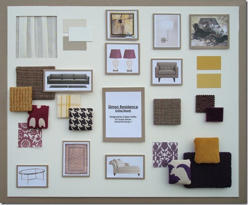
And here is the design board. I went with a purple and yellow color palette which I thought was sophisticated without being too serious.
- The chairs are from Room and Board upholstered in a tweed
- The chaise is from Baker upholstered in a Knoll boucle
- The 1964 sofa is from Hive Modern upholstered in a Room and Board tweed
- The pillow fabrics are in a variety of great patterns and textures including a graphic hounds tooth, faux croc, mohair, velveteen and chenille, all from Duralee, Calico Corners, Glant, and Stout. I chose these fabrics because they are traditional materials and patterns with a modern spin and in fresh colors, keeping with Susan’s personal style …
The sheer fabric on the top left (by Kravet) is for the window treatment. The style is shown below… 
This is the art on the wall behind the chairs. It is actually a Japanese screen made of mulberry paper with horses and cranes in front of Mt. Fuji painted on with mineral pigments and gold. I love the smoky tones and the subtle buttery and dusty lilac colors which tie into the rest of the room…
Another great piece of art is this 1974 GQ cover from Conde Nast with Robert Redford on the front…
This pen and brown ink is called “Allegory of the Liberal Arts” by Domenico Piola from Genoa, Italy, dating back to the late 1600’s. It was a prep drawing for a large decorative canvas…
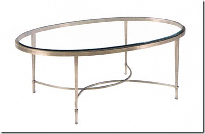
The coffee table I wanted to be beautiful, feminine, and light in visual weight, so I chose this one (and a matching end table for between the chairs) from The Thomas Pheasant Collection for Baker, made of antique brass...
Next to the sofa is this great Italian mercury lamp. The two white urn lamps with silk shades on the right were an option if the client preferred a more traditional mantle over the fireplace. Great because they’re traditional in shape and modern in color…
I am crazy about these fun little things! They are brass “Kaleidoscopes” by Kelly Wearstler for Bergdorf Goodman. I thought they would look fabulous on those ledges over the fireplace or to one side on the hearth seat…
And last, but not least, is this show-stopper of a rug. A to-die-for Persian Tabriz in golden wheat and blackberry tones. To be drooled over, but certainly not on, since it runs about as much as my house is worth. But hey, that’s the price you pay for a drop-dead gorgeous home and I guarantee once it was on your floor, you would never regret it. Like a shot of Botox for your home and worth every penny…


Lovely, lovely! The artwork is my favorite part-and the fabrics-and the lamps...
ReplyDeleteThanks Karen! I'm a huge lover of art, it's one of the most important parts of a room design, I think. It's something very personal that can truly express who you are and your views on life, and the bigger the collection the better. Fabrics are an obsession for me, too. I'm a touchy feely person so I love to include lots of texture! One of my favorite things about this project was blending the traditional with the modern, sort of representing the woman's chicness and sophistication but also the "life" and adventure/fun found in a fresh start.
ReplyDelete